Signs featuring dimensional letters offer increased visibility, dignity and charm.
带有立体字的标识具有更高的可见度、品牌力和吸引力。
The past couple of months have seemed like we’ve entered a different dimension. But one thing that hasn’t changed in the new world we live in is dimensional letters. Dimensional signage has remained a popular choice of signmakers for decades, and with the advancement of backlit letters and LED options, should continue to prosper for years to come.
过去的几个月里,因为疫情原因,全世界都像是进入了一个不同的维度,但有一样东西在我们日新月异的世界里却数十年如一日般没有变化,那就是:立体标识,自诞生以来一直是标识制作者的普遍选择,现在伴随着发光字和LED技术的发展,可以预见在今后很长一段时间里,立体标识都将继续繁荣发展。
TWO CLIENTS, ONE SIGN COMPANY
两个客户,一次搞定
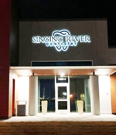
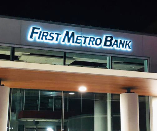
For First Metro Bank and Singing River Dentistry, neighbors located in Muscle Shoals, AL, a vintage aesthetic was the dream. But first, they had to resolve a disagreement: First Metro leaders wanted reverse-lit dimensional letters. After all, that’s what General Sign Co. (Sheffield, AL) had created for them in the past. When decision-makers at Singing River hesitated, General Sign used Adobe Illustrator and Gerber OMEGA to design various samples of fabricated letters. The dentists’ office was convinced to invest in the letters after seeing different locations with the signs illuminated at night.
阿拉巴马州肌肉浅滩的First Metro银行和Singing River牙科诊所是邻居公司,巧合的是两家都喜欢复古美学,并期望自己的标识也有复古范儿,但他们的领导人在如何“复古”上出现了分歧,First Metro银行的领导希望使用反射发光的立体字,并率先找到General标识公司为他们设计,但Singing River的决策者因为担心效果有些犹豫,但当General标识公司使用Adobe Illustrator和Gerber OMEGA软件设计出各种发光字样本寄过去后,他立刻发现了这样的标识在夜间照明上的不凡,决定投资建造这些发光字标识。
In addition to reverse-lit letters for their exterior wall, First Metro ordered a set of 30-in.-tall freestanding letters to spell out the bank’s name along the side of the building, adjacent to the drive-through window. From previous projects, General Sign already had the necessary artwork. “It was just a matter of designing and sizing everything appropriately,” said Matt Stansell, vice president of General Sign. “We also worked with both clients to ensure we got their colors just right.”
除了外墙采用反射发光的发光字外,First Metro银行还订购了一组将近80厘米高的独立式字型标识,沿着建筑物侧面车道的地方拼写成银行的名字。
对于General标识公司来说,这样的项目在之前就已经有了技术基础,制作起来很轻松,公司副总裁马特·斯坦塞尔说:“这是适当设计和调整大小的问题,唯一需要注意的是颜色的准确性,我们与两个客户一起合作,确保了色彩的正确无误。”
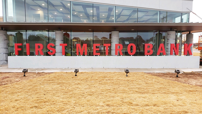
First Metro also had a set of 30-in.-tall freestanding letters spelling out the bank’s name along the side of the building in addition to reverse-lit letters for their exterior wall.
First Metro银行还有一组将近80厘米高的独立式字型标识,沿着建筑物侧面车道的地方拼写成银行的名字。
To fabricate the channel letters and dimensional letters, General Sign reached out to Sign Builders (Birmingham, AL), a longtime partner. While smaller in size, the letters for the side of the building had to be fabricated to withstand someone leaning on them. These letters were a collaboration with Eric Watson at Sign Builders. To make sure the internal support of each letter would be sufficiently sturdy, they were fabricated with internal framing. The fronts and backs were constructed from .125-in.-thick aluminum with .063-in. aluminum on the sides, then painted with Matthews Paint in a matte finish.
为了制作发光字和立体标识,General标识公司与长期合作伙伴Sign Builders公司取得了联系,因为建筑物侧面的字型标识虽然尺寸不大,但承受的倾斜力却不小,必须确保每个独立字母的内部支撑足够坚固。Sign Builders公司的艾瑞克·沃特森使用内部框架完成了制作,正面和背面均为厚度3毫米的铝材料,侧面用1.6毫米的铝材料,最后用马修斯漆进行哑光涂装。
Among the challenges for mounting the LED signs were limited amounts of space and places to disguise power supplies, especially for the First Metro Bank display. “The bank’s flying ‘F’ logo … was to be installed on an area of the building that would have no access from behind,” Stansell said. “We decided to install the power supplies on-board so that we can service the signage in the future without gaining access behind the sign.” The rest of the project could be completed with off-board power supplies and help from an electrician to route the low-voltage wires. “When we install the power supply ‘on-board,’ that means the LED power supply is inside the sign, so it is self-contained,” he said. “All you have to do is bring in the electrical circuit. ‘Off-board’ signage has the power supplies in a remote location, usually behind the wall on the inside of the building.”
即使对于制作技巧熟练的标识公司来说,安装LED标识仍会有挑战,比如在有限的空间里安装,还有如何伪装电源,斯坦塞尔说:“在First Metro银行的项目中,那面悬挂的‘F’型标识,需要被安装在完全实心的表面上,所以我们决定使用一体式电源,以便于日后的维护工作,除了这面标识以外的其他标识则全部使用分离式电源。”
对于一体式和分离式电源的区别,斯坦塞尔补充说道:“一体式电源意味着LED电源位于发光字的内部,整体独立,唯一需要做的就是接通电路;而分离式的电源主体在远处,需要在电工的帮助下进行低压电线的布线。”
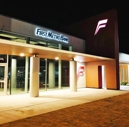
The LED modules and drivers for the letters and logos were provided by HanleyLED. When all was said and done, both clients could show off their new signs and letters, both illuminated and not.
发光字标识和LED模组的驱动由HanleyLED提供。
当整个标识工程结束后,两名客户不论在光源是开是关的情况下,都在向人们炫耀自己的“复古”新标识。
BANK ON IT
就决定是你了,立体字
The Mercantile Center, located in the heart of downtown Cincinnati, is a nightmare site for any construction zone. East Fourth Street, one of the busiest in the city, plays home to the massive 15-story bank and office building. The street itself is usually bustling with business people and tourists; a single fender-bender can close the street for hours. But for Steve Kapuscinski, owner and president of Image360, Cincinnati-Blue Ash (Blue Ash, OH) , the Mercantile project was one of the smoothest in his somewhat recent career in signs. Purchased three years ago by Kapuscinski, this Image360 franchise is a full-service marketing and print communication firm.
辛辛那提市中心东四街,有着被称为“施工噩梦”的商业中心大厦,这条街道是整座城市最繁忙的街道之一,且不提15层大厦含有的大型银行和写字间里巨大的人流量,光是街道上的商贩和游客就足够挤得水泄不通了,想要在这样的街道上进行施工几乎是不可能的事情,仅仅一个挡泥板弯板机就会让整条街道瘫痪几个小时。
但史蒂夫·卡普钦斯基领导下的Image360,在这条街道上却流畅地完成了一个标识工程,即使以卡普钦斯基多年的标识制作经验,这次制作的速度也是非常惊人的。
Image360是一家提供全方位服务的营销与印刷传播公司,在三年前被卡普钦斯基收购了专营权。
For years, The Mercantile has had dimensional letters in their facilities. They decided to continue this look when it came to a new sign. Image360 sent mockups, generated with Adobe Creative Suite, of the entrance way with differing sizes of letter combinations until the client selected one. To achieve the desired brass look on the dimensional letters for the Mercantile, Image360 worked closely with Gemini, which sent over several solid-brass materials and finishes to choose from.
多年来,商业中心大厦及其内部设施中都带有立体字,他们决定在制作新标识的时候继续使用这种外观,Image360通过Adobe Creative Suite生成了不同大小的入口处字型标识模型,直到客户满意为止。
为了在大厦的字型标识上获得理想的黄铜外观,Image360与Gemini紧密合作,后者提供了多种固体黄铜材料和饰面供以选择。
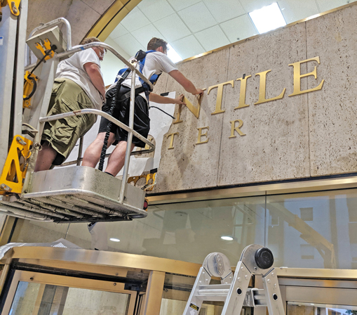
Image360, Cincinnati-Blue Ash (Blue Ash, OH) proceeded with installation after normal business hours due to traffic concerns. The sweeping staircase in the front of the building was also a bit of a challenge.
由于交通原因,Image360在下班的时间进行的安装,大厦前的宽口楼梯对标识安装也是一个挑战。
Attempting the installation during regular 9-5 business hours was quickly deemed impractical. “We had to schedule after normal work hours because the building is on a main street in downtown Cincinnati,” Kapuscinski said. The outdoor design of the building also complicated matters. The grand, sweeping staircase in the front of the building remained the most complicated piece of the puzzle. “The steps presented a bit of a reach challenge for the boom we had to use, but placing two of the stabilizers on the steps got us close enough to work,” he said.
在早九晚五的上班时间内为商业中心大厦安装标识,即使速度再快也是不现实的,卡普钦斯基说:“我们必须在正常的工作时间过去之后再安排安装工作,因为这座大厦位于主干线上,而且它的室外设计也让安装变得复杂,大楼前宽阔的楼梯就是其中最难的一部分,这些台阶让我们的吊臂难以工作,只能通过放置两个稳定器的方式让工人足够接近安装表面。“
The larger letters are 14 in. tall, while the smaller letters are 6 in. The material comprises 3/8-in. solid- brass plate, routed to shape, given a brushed finish and are clear-coated for weathering. Once in position, the letters from Gemini were easily installed after drilling into the travertine wall. The installation took the team three hours, after which The Mercantile Center featured the new, brassy dimensional letters for the next morning’s customers.
整个标识中,最大的字母有35厘米,最小的有15厘米,这种材料的厚度接近一厘米,是实心黄铜板,具有一定的形状,表面经过拉丝处理,并涂有透明图层以防风化。安装时,首先在石灰岩的墙壁上钻孔,再将字母对准一一安装,整个过程花费了团队三个小时的时间,但让商业中心大厦在第二天一早,就可以用崭新的标识向人们问好。

BACK TO SCHOOL
重返校园
When Meadowview Elementary in Oconomowoc, WI decided to install new dimensional letters in their school, they knew exactly who to reach out to. Before assuming ownership of a FASTSIGNS franchise in nearby Waukesha , owner Lori Dominiak worked for the school district.
对于威斯康星州奥康诺莫沃克市的Meadow view小学来说,是否安装标识比找谁安装标识是一件更难决定的事情,因为当地一家著名的Waukesha设计公司,在取得FASTSIGNS特许经营权之前,公司老板洛瑞·多米尼克一直在为学区工作。
“I just knew that with the space we had to work with, we needed the letters to really stand out and we didn’t want something super heavy,” Dominiak said. Fastsigns’ graphic designer used an Adobe Illustrator file to convert a mock-up the school provided into a CFF file that was used to manufacture the letters.
多米尼克说:“在我的设计中,我需要立体字们在安装的空间中真正脱颖而出,而且保持尽可能轻巧的重量。”因此Fastsigns的图形设计师使用Adobe Illustrator文件将学校提供的模型转换成用于制造字幕的CFF文件。
The need for lighter letters led Fastsigns to Custom Foam Fabricators, which manufactured the 16-in.-tall, 4-in.-deep letters and 41 x 53 x 4-in. logo from sign foam, which weighs considerably less than wood and metal alternatives. Metal letters occasionally require backlighting to really make them stand out. Wood letters can offer a timeless look. Both are fairly easy to cut or carve and are durable; however, they also can be more costly and difficult to shape than sign foam.
由于需要轻巧的标识,Fastsigns找到了定制泡沫制造商,后者为其制作了40厘米高,10厘米深的字型标识,以及一块104*134*10厘米的大Logo,重量比同样大的木材和金属轻得多,而且金属字母大多数时候需要背光才能真正脱颖而出,木制字母的外观一成不变,这两者的有点事都很容易切割或雕刻,并且坚固耐用,但是它们也更昂贵,更难以成型。
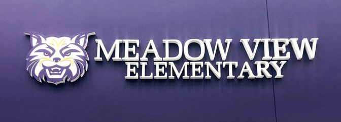
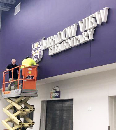
FASTSIGNS of Waukesha knew it lighter letters for the Meadow View Elementary project. The letters were constructed from sign foam.
Waukesha的FASTSIGNS知道它对Meadow View 小学项目来说是较轻的字母。这些字母由标志泡沫制成
After the ease of designing and creating the letters came the difficult part: shipping them without damage. Foam tends to be a very malleable item and these letters were no exception. “Since the letters are made from foam, the shape wanted to bend from the wrapping process,” Dominiak said. The letters were shipped wrapped in layers of plastic to protect them. Thankfully, the letters that did bend could easily snap back into place with a gentle touch.
在简化设计和制作标识之后,Fastsigns面临了整个标识制作中最困难的部分:保证运输时的安全无损。泡沫的延展性非常好,将其制作成标识后也不例外,这些字型标识在运输前被包裹在一层塑料中以保护它们,但它们的形状会在包裹的过程中出现弯曲,幸运的是这样的弯曲可以回弹至原位。

After the safe arrival of the letters, Fastsigns went straight into installation. Using a standard cherry-picker lift, they attached the letters to the building via studs. “This was a fun project to have. We had a good feeling that it would turn out good, but it was far better than we expected.”
当标识安全到达后,Fastsigns立刻进行安装工作,他们使用标准的“采摘樱桃”升降机,通过双头螺栓将字型标识装在建筑物上,多米尼克说:“这是一个有趣的项目,在项目刚开始时我对成果就有一个很好的感觉,但是现在比预期的还要好得多!”
