Three signshops find flexibility in rigid substrates.
三个标识店的案例展示刚性基材的灵活性
Rigid substrates. Is there any other industry term that literally states its inability to move, bend or flex? Two words, very little wiggle room for interpretation. And yet, when called upon to manipulate such materials, signshops are asked to bend to their clients’ will, and make stubborn substrates conform to the vision. Whether secured to a wall, an awning or an overhang; 3D, flat, or a combination of both, the rigid is made flexible under the sure hands of these three veteran shops who were tasked with the creation, fabrication and installation of some very tough stuff.
看到刚性基材中的“刚性”二字,就知道已经无需再用其他术语从字面上说明这种材料有多么不灵活了,但是在标识制造商实际操作时,往往会被客户要求将这些刚性基材“捏圆搓扁”,固定在墙壁、遮阳篷或悬挂物上,达到他们想要的视觉效果。
如果你也遇到上述的困难,就来看看下面三家标识作坊是如何完成这些作业的吧,他们无一不是经验丰富的老手,擅于设计、制造和安装一些非常坚硬的东西,不论是立体还是平面的或是相结合的刚性基材经过他们的制造都会变得非常服帖。
TOP O’ THE AWNING
当心!你的头上
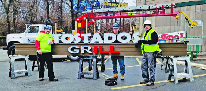
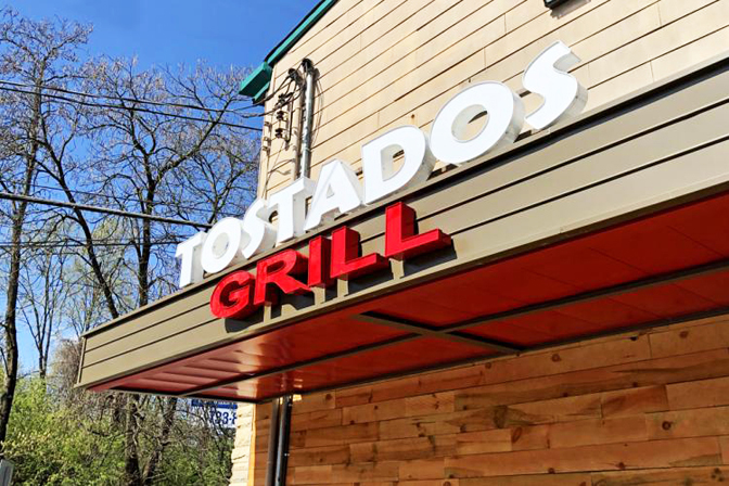
Anchor Sign & Awning (Cincinnati) owner Scott Woosley still prefers to conduct business old school. Leading with his belief that “a sign on your building or vehicle is still the best value for marketing,” he’s able to drum up business simply by making cold calls. “Yep, the oldest method of marketing is still valid in 2020,” he said. “[Tostados Grill] was a new client who simply said to my partner and sales manager Kyle [Woosley], ‘Show me what you got.’”
Anchor Sign&Awning是美国辛辛那提的一家标识作坊,老板斯科特·伍斯利仍然在以老派的方式做生意,他坚信“建筑物或车辆上的标识仍然具有最佳的营销价值”,而他也一直通过电话销售促进业务发展,他说:“最古老的营销方式在2020年仍然有效,我们最近一位新客户Tostados Grill,他只对我的合伙人和销售经理凯尔·伍斯利说了一句‘看看你们能做成什么样子’,这单生意就成了。”
The Woosleys were thrilled to be granted full artistic license on the Tostados project. “The customer had a difficult-to-read logo and a variety of deteriorated on the building,” Scott Woosley said. Offering a more contemporary, clean look t signageo the client in their bid, Anchor’s design included fabricating the new Tostados sign out of channel letters attached to a new metal awning. Because the new awning and sign would face the street, the restaurant would become more appealing to local vehicle and foot traffic, plus passersby.
伍斯利很高兴Tostados项目能让他全权把控艺术设计,他说:“客户在之前的建筑物上有一个难以辨认的徽标和各种劣化的标识,我们作坊在投标时为客户提供了更有现代感也更干净的外观设计,建筑翻新后的遮阳篷和导视标识将面向街道,它们会让这间餐厅对当地的车辆和行人更具有吸引力。
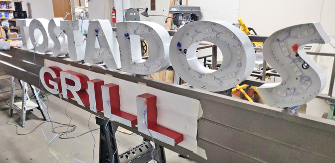
Anchor Sign & Awning (Cincinnati) created a more contemporary sign for local Tostados Grill out of channel letters attached to a new metal awning.Anchor Sign&Awning为当地的Tostados Grill餐厅设计了一面更具现代感的标识,图为新金属遮阳篷上的发光字。
Due to delays caused by permit hiccups, the Anchor team made adjustments to the channel letter support to accommodate a newly accepted set of wind-load criteria during the engineering process. The design team used CorelDRAW and Photoshop to create the restaurant-sign designs. The awning’s frame was made out of 1-in. square tubing, while the skin consisted of prefinished steel made by Metal Panel Systems, and the channel letters were supplied by Sign Source USA.
由于许可证迟迟没有下来,Anchor团队对发光字的支撑进行了调整,用来通过工程中需要接受的风荷载标准检测,遮阳篷的框架由2.5厘米厚的方形管材构成,表面是用Metal Panel System公司制造的成品钢二次加工而成,发光字则由Sign Source USA提供。
设计团队在软件方面使用了CorelDRAW和Photoshop来创建餐厅标识的设计模型。
Since the frame was steel and rather large, Scott Woosley said that the Anchor team used a Vulcan Omnipro 220 MIG welder, a band saw and a grinder to do most of the work getting the frame to size. For paint, they chose a direct-to-metal acrylic polymer paint from Cincinnati Color Company.
斯科特·伍斯利表示,这面标识全部是钢制架构,体积也十分巨大,为了让标识达到预定的尺寸,锚固团队选择使用Vulcan Omnipro 220 MIG焊机以及带锯和砂轮机来完成大部分工作。
在涂料的使用上,他们订购了辛辛那提本地颜料公司的类金属亚克力聚合物涂料。
Scott Woosley foresees more metal awnings in Anchor’s future, citing a trend toward metal over fabric and the wealth of metal systems available to fabricators nowadays.
斯科特·伍斯利预测,在今后的订单中会出现更多的金属制品,也就是需要用到更多刚性基材,原因是当今可以利用的刚性基材越来越多,对于金属的应用越来越近似于纺织面料了。
NOT YOUR STANDARD REMIX
不是您的要求,但是我的追求
Like a lot of projects, the client requesting the REMIX Audio Bar sign was a repeat for ArtMan Productions (Santa Fe, NM) . Having completed satisfactory work for the client before, ArtMan was undeterred by design challenges for what they considered an interesting project.
在大多数的项目中,不同的客户都会提同一个要求,那就是按照他们所设想的去设计标识,位于新墨西哥州圣塔菲的ArtMan制作工坊最近的客户REMIX Audio酒吧就提出这样的要求,但ArtMan并没有因为这种情况而感到诅丧,相反却对这个有趣的项目所面临的设计挑战跃跃欲试。
For starters, the client’s business is in a unique niche, wherein the owner of Remix, “Takes an existing electronic music culture lifestyle and remixes it in a way she says no one has done before,” Creative Director Peter Tengler said. “She wanted a sign to echo her vision, and, after reviewing the layout we created, gave us free reign with regard to materials and execution of her concept.” Tengler said that the client provided the logo image and branding, but that ArtMan was responsible for the rest of the entire project – from concept to installation. They slightly altered the image using Adobe Photoshop and Illustrator, and then got to work on creating the client-approved sign.
对于初入标识行业的人来说,把注意力放在提高客户的生意上也许是个不错而独特的选择,ArtMan的创意总监皮特·特格尔说道:“根据Remix的老板描述,她的这家酒吧采用流行的电子音乐文化表达着生活方式,这是一种从未有人尝试的模式,她需要一个标识来反射出她的愿景,但是在查看了我们创建的设计模型后,她很快决定让我们的团队自由执行材料和概念的选择。”
Remix酒吧提供LOGO图像和品牌文化,整个项目的其余部分,从概念设计到安装都由ArtMan负责,他们先使用了Photoshop和Illustrator稍微修改了LOGO图案,然后开始整体创建客户所期望的标识。
Since ArtMan’s concept called for combining multiple circular layers of laser-cut translucent acrylic from Gemini; colored plexiglass from Port Plastics; and printed, 3M Air-Release vinyl applied to the back side of the outward-facing layers, extreme precision was required to perfectly align and space all the layers, giving the sign its desired look, Tengler said. ArtMan laser-cut the acrylic and plexiglass both off-site and in-house. The vinyl was printed in-house on a Roland VersaCAMM 540 wide-format printer and common hand tools were used for assembly.
ArtMan的概念是:将多个半透明的圆形模块一层层地组装在一起,然后将3M Air-Release乙烯基印刷在最外一层的背面。
这需要极高的精度才能完美对齐和间隔每一层,使整块标识具有最理想的外观,于是ArtMan在原料方面选择了刚性基材:PortPlastics出品的彩色有机玻璃以及半透明的亚克力,用Gemini激光切割内外操作,将它们制成圆形,乙烯基则用Roland VersaCAMM 54宽幅打印机上进行印刷,最后用手工方式将它们组装起来。
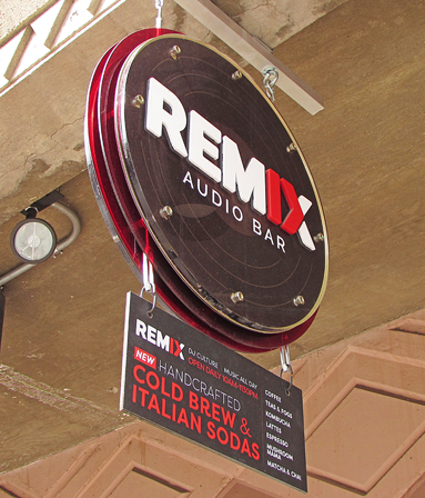
ArtMan Productions (Santa Fe, NM) combined multiple circular layers of laser-cut translucent acrylic to make a sign that echoed the vision of music/culture/lifestyle shop REMIX Audio Bar in their hometown.ArtMan 结合了多层圆形的激光切割半透明亚克力材料,制成的标识与REMIX Audio 酒吧的电子音乐、乡土民谣等生活方式文化相呼应。
ArtMan made sure it opted for the right rigid substrates. “Most of our production utilizes rigid substrates,” Tengler said. “Choosing the type of rigid substrate is determined by many factors [such as] structural integrity, durability, design and aesthetic considerations, and the overall budget for each individual project.” In the future, Tengler expects to see more signs created like Remix’s, as the trend for rigid substrates tends to be leaning toward aluminum composite materials with digital print and/or plotted-vinyl applications, popular because of their economy, weight and reasonable durability.
特格尔说:“ArtMan能确保选择到合适的刚性基材,事实上我们大部分的生产都使用的刚性基材,选择这种类型的材料取决于许多因素,例如结构完整性、耐用性、设计感和美学考虑,以及项目的总体预算,在今后我们将会设计更多类似Remix这样的标识,因为刚性基材与数字印刷和乙烯基印刷的发展趋势不谋而合,将会更加经济,而且它们的重量和耐用性都是极好的。”
Another favored material Tengler sees in the Southwest is raw steel left to rust or that has been powder-coated because it fits aesthetically into a rugged environment, has contemporary appeal, withstands harsh weather conditions and has almost unlimited durability.
特格尔回忆,他曾在美国西南部看到过一种在当地很受青睐的材料——生锈的或粉末涂层的粗钢,原因是它可以制造出非常崎岖的外形,非常具有现代艺术的吸引力,并且可以承受恶劣的天气调节,同时还具有近乎无限的耐用性。
METAL LOGO A GO-GO
金属LOGO GO!Go!Go!
Just about every business has a logo. But what good is a logo if no one sees it? It’s an easy way for people to identify you and your business, after all.
几乎每个企业都有自己的LOGO,这是最简便的提升公司形象识别度方式,但如果这个LOGO不那么引人注目,就一点用处也没有了。
And the visible-logo-making business just happens to be the business in which Metal Logos (Omaha, NE) , thrives, as they custom-make client logos into signage through a blend of technology and craft. It was this mix of automation and hands-on skill that spurred leaders at Oscar W. Larson Co., who provide full-service petroleum and fluid-handling equipment, to inquire about a logo-signage project for all nine of Larson’s locations throughout the Midwest.
制作具有识别性的标识是Metal Logos公司的主要业务,这家位于内布拉斯加州奥哈马的标识公司依靠这项业务蓬勃发展,他们通过技术和工艺的融合将客户LOGO定制为一整块标识,正是这种自动化和手工技艺的结合,帮助他们接下了Oscar W.Larson公司的领导者,将九个区域的LOGO标识业务交给了他们,Larson公司是美国中西部一家提供全方位的石油与液体处理设备的大企业。
The client asked for a unique and classy way to display their logo, mission statement and various locations throughout Michigan, Ohio, Indiana and Kentucky. Although the Larson project required several types of materials, CEO Shawn Dubbs said the Metal Logos team didn’t mind. “These types of projects are very fun for us to work on and design,” he said.
Larson项目要求一种独特而优雅的方式来展示LOGO,并且在密歇根州、俄亥俄州、印第安纳州和肯塔基州的各个位置,要使用不同的设计语言,而不同的设计语言意味着需要多种类型的材料,但CEO肖恩·杜布斯却表示,Metal Logos团队并不介意这样的挑战,反而觉得这样的设计非常有趣。
As it typically does, Metal Logos suggested a design that is similar to the image the client desires. “We do this [for the client] by showing photos of our existing project gallery,” Dubbs said. “Then [we suggest the client] ask to have it bid out so they have several options in material costs to have the project produced at a budget they are comfortable with.”
通常来说,Metal Logos会按照客户的期望进行设计,首先他们将所有的项目图片制成画廊,让客户在其中观看选择,然后建议客户进行招标,以便客户在材料的成本方面有多种选择,最后再根据客户认为合适的预算进行制造。
To that end, Metal Logos was tasked with matching the PMS-painted blue letters on Larson’s mission statement to the CMYK that would be printed on the sign’s acrylic elements. “We needed to match the blue colors in flatbed printing and painted dimensional letters, which required a lot of samples,” Dubbs said.
在Larson项目中,Metal Logos要将涂有PMS的蓝色字母与青红黄黑四种印刷基色相匹配,以选择出合适的颜色印在制作标识的亚克力上,这需要在大量平版印刷与彩绘的立体字母上匹配蓝色的样本。
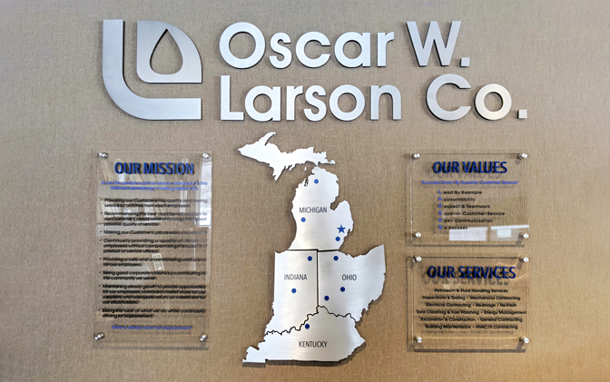
Metal Logos (Omaha, NE) was tasked with creating signage for all nine locations of the Oscar W. Larson Co. throughout Michigan, Ohio, Indiana and Kentucky.Metal Logos的任务是为Oscar W. Larson公司在整个密歇根州,俄亥俄州,印第安纳州和肯塔基州一共九个地点创建标牌。
After the design was finalized and the colors matched to the client’s satisfaction, the Larson’s marketing designer sought more depth on the mission statement lettering. So, Metal Logos added more dimensionality to the acrylic via flatbed printing with stand-offs.
色彩匹配的结果让Larson公司非常满意,但他们的市场设计师又提出了新的要求:使标识的文字部分看起来更有深度。
为此Metal Logos在亚克力上采用带有支架的平板印刷为其增加尺寸。
Substrates used on the logo signage throughout the multiple projects include ¼-in. natural satin aluminum for the main lettering and the state cutouts. The images on the states were router-engraved and then paint-filled with cool gray PMS 10C. The see-through sheets stating Larson’s mission, values and services are painted in PMS 293 and mounted onto ⅜-in. clear acrylic sheets with fired edges. The main text was flatbed-printed PMS 203 on the face of ⅜-in. clear acrylic. The star and circle shapes were crafted out of ⅛-in. aluminum and then painted PMS 293. Metal Logos used a CNC, waterjet and flatbed printer for fabrication and Matthews Paint for all painted elements.
在九个标识的制作中,大部分使用的基材都是刚性基材,包括0.6厘米(1/4英寸)与0.3厘米(1/8英寸)厚的天然缎面铝(利用雕刻机镂空,分别被制作成字母和星形以及圆形)以及边缘进行烧制的透明亚克力材料。
州地图部分使用铝材料制成,冷灰色PMS10C进行喷涂;印有公司价值、服务以及使命感的透明纸则以PMS293涂装,并以安装孔固定在亚克力上;主要文本则以平板印刷在亚克力材料上再涂以PMS203;镂空的铝制星形与圆形则用PMS293上漆。
Metal logos全过程使用数控的高压水枪切割机与平板打印机,所有的涂装元素则使用Matthews Paint。
Dubbs doesn’t see the demand for rigid substrates declining any time soon. “[We] believe that the individually mounted logo made out of rigid substrates is coming back to the forefront of most high-end build outs,” he said.
杜布斯认为刚性基材的需求量还会不断增加,且短期内不会下降,他说:“我个人认为,由刚性基材制成的模块形标识,在大多数的高端建筑设计中已是主流。”
