Success in business is never guaranteed. Offering something of value and building lasting trust with clients may sound simple in theory, but is not necessarily easy when put into practice.
谁都无法百分百保证能获得商业上的成功。从理论上来说,成功只需要提供有价值的东西,并与客户建立持久的信任——这听起来简单,但在实践中却并不容易。
Amidst the surge of industrial innovation, brutally competitive marketplaces, and the shifting uncertainty of economic climates, it takes something extraordinary to stand the test of time. Moreover, longevity in business is one of the true markers of success.
在工业创新激增的今天,市场竞争异常激烈,经济气候充满不确定性,不断变化。在这样的背景下,一个企业想要经受住时间的考验,就必须得作出一些非凡决策,毕竟长寿是成功的真正标准之一。
Coming up with a concept
提出概念
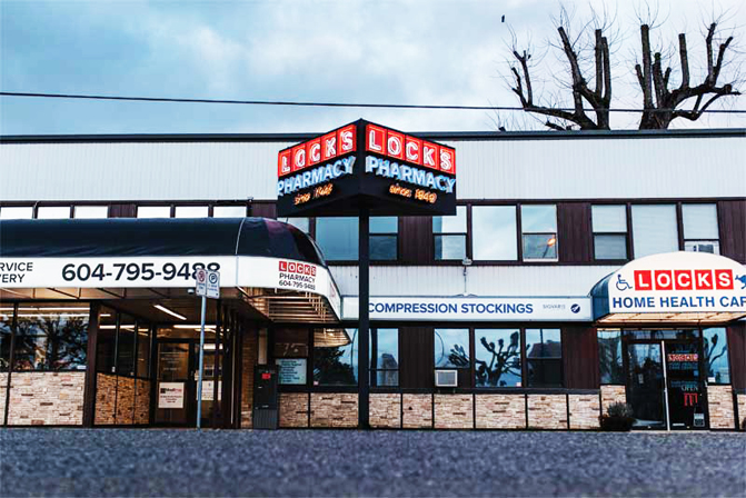
When Lock’s Pharmacy, located in Chilliwack, B.C., was approaching its 70th anniversary, the owner, David Lock, decided to pay homage to the history of the pharmacy and its status as a community institution.
洛奇药房,位于不列颠哥伦比亚省奇利瓦克市,在临近其70周年庆典之际,老板大卫·洛奇决定向药房的历史以及其作为一个社会机构所获得的地位致敬。
“My parents started this pharmacy in 1949, when the roads were dirt out front, and there was a barn next door,” recalls Lock. “I wanted to celebrate and honour them for building this drugstore by throwing a big community party, and by putting up a brand new sign.”
“我的父母于1949年开办了这家药房,当时的道路上积满灰尘,隔壁是一个谷仓。”洛克回忆道,“我想通过举办大型社区聚会并安装一个全新的标识来庆祝药店的70周年,致敬我的父母建立这家药店的能力,以及药店数十年所获得的荣誉。”
For many years, Lock Drugs, as it was known at the time, had a freestanding neon sign installed in front of the store—a stylized prescription bottle that made the store instantly recognizable.
多年前洛奇药店曾有过一个经典的标识,在人们仅存的印象中,是一个在店铺门前安装的独立式霓虹灯,外型是制式处方瓶的样子,让人一眼就能看出是一家药店。
The sign, although iconic for its time, had long since been lost to the development of the area. As a result, when Lock approached TDH Experiential Fabricators with some hand-sketched ideas for a new sign that was as visually striking as the original, the Surrey, B.C.-based sign shop immediately rose to the challenge and embarked on a creative journey to fabricate a product that could capture the history and nostalgia of the pharmacy.
该标识虽然非常具有标志性,但毕竟早已在地区的发展中消失了,为了找回曾经标识的感觉与影响力,洛奇带着一些手工勾勒的图案与想法,找到在萨里市颇有名气的标识公司:TDH专家拍档,这也为后者带来不小的挑战。经过一些初步的考量与设计,TDH专家拍档开始了他们创造性的标识制作工作,目标是一个可以致敬药房的历史的怀旧标识。
The owner’s initial thought was to mount a three-dimensional sign to the parapet wall over the pharmacy’s entrance. However, after discussing the structural concerns as well as some bylaw limitations with TDH, Lock realized the solution was even better than what he had hoped for. The sign team proposed a freestanding pylon sign rising above the canopy—visible from 180 degrees—with a unique wedge-shaped design and, of course, neon.
店主最初的想法是在药房入口上方的护墙上安装一个多面立体的标识,但是在与TDH讨论了结构性问题以及当地某些标识章程的限制后,TDH标牌团队提出一种独立的塔架标牌方案,上方是具有独特楔形设计的顶篷,当然还有霓虹灯,最大可视角度为180度。洛奇立刻意识到这套解决方案甚至比他希望的还要好。

To commemorate the history of the pharmacy and its status as a community institution, TDH fabricated a sign that incorporates the store’s founding year into the logo.
为了纪念洛奇药店的历史以及其所获得的社会地位,TDH制作了一个标识,将该店的创立年份纳入LOGO中。
Overcoming one challenge at a time
依次解决
Building a structurally sound sign full of neon, mounted on a single 203- x 203-mm (8- x 8-in.) wide post, was definitely not an easy task.
独立塔架标识的支撑柱为203*203毫米的方形柱,想要在这上面建造一个结构健全的霓虹灯标识,显然不是一件容易的事。
The team started by creating the frame from a 51- x 51-mm (2- x 2-in.) steel angle to provide a rigid structure, with added cross bracing. Central to the build was a slip-tube system to support the sign—a steel tube centred inside the structure that also matched the post to which it would be mounted. Further, a steel plate was welded to the post, which ensured the sign could be installed on-site at the correct height.
为获得坚固的结构,TDH团队首先用51*51毫米的钢角创建整个标牌结构的框架,这种框架还附带额外的交叉支撑力;整个建筑的中心是一个支撑标牌的滑动管系统——一根钢管集成在内部结构中匹配上标识杆,而标识杆上焊接钢板,以确保标牌可以在正确的高度现场安装。
Next, a work platform was constructed inside the sign to stand on should a repair to internal components ever be required. Individual shelves were also built for each of the seven neon transformers to keep the wiring organized.
TDH’s lead fabricators patiently worked through the layout, one item at a time, until the wiring and attachments were secure, and the internal elements were concealed.
团队还专门在标牌内部构造了一个工作平台,以便在后期需要维修内部组件时方便人员站立。另外,七个霓虹灯变压器也都有单独的架子,保持布线整齐。
TDH首席制作官耐心地调整了整个布局,依次解决每个问题,直到最后牢固地固定了布线和霓虹灯附件,将所有内部元素隐藏起来。
For the sign faces, 72-mm (3-in.) deep open channel logo squares were painted red and installed with matching trim cap retainers and clear acrylic faces to protect against any vandalism. The letters in the logo squares were hand painted white with a black keyline for additional contrast against the red. The keyline and paint together provided increased definition to the letters against the 12-mm (0.5-in.) designer white neon tubes. The look was completed with similar-sized ruby red neon borders to mimic Lock’s logo.
标牌正面,72毫米厚的正方形槽型字被涂成红色,安装色彩匹配的装饰盖、固定器和透明的亚克力,以防止日常的损坏;方块中的字母手绘成白色主体和黑色描边,与背景红色形成清晰对比,也一起为字母内12毫米的白色霓虹灯管提供更多定义;外观照明使用红宝石色的红色霓虹灯,模仿洛奇药店原本的LOGO。
The lettering for ‘Pharmacy’ was created with hand-bent 76.2-mm (3-in.) deep open channel letters, each 254 mm (10 in.) tall. The letters—this time painted white and installed with matching trim caps and clear acrylic faces—were contrasted with 12-mm (0.5-in.) horizon blue neon.
“Pharmacy”(药店)字样是用76.2毫米深的手工弯曲发光字制作,单个字母高254毫米,涂成白色,同样安装匹配的装饰盖和透明亚克力,与12毫米的地平线蓝色霓虹灯形成对比。

For many years, Lock Drugs, as it was known at the time, had a freestanding neon sign installed in front of the store—a stylized prescription bottle that made the store instantly recognizable.
多年前洛奇药店曾有过一个经典的标识,在人们仅存的印象中,是一个在店铺门前安装的独立式霓虹灯,外型是制式处方瓶的样子,让人一眼就能看出是一家药店。
For the last set of letters, which read ‘since 1949,’ 72-mm (3-in.) deep open channel letters were hand painted yellow and finished with 10-mm (0.4-in.) gold neon.
最后一组字母,即表明药店历史的“Since 1949”(始于1949),是将72毫米厚度的字母手工涂成黄色,并以10毫米金色霓虹灯装饰。
Fits like a glove
如臂使指
The finished sign was installed on a custom-engineered concrete base with an internal rebar support cage. Next, the steel tube support post was installed, with the baseplate anchored to the concrete. Finally, the triangular sign was lifted into place with a crane truck. The whole process took more than an hour. Once all the elements slid into their proper place, the power was connected and the neon came to life, displaying ‘Lock’s Pharmacy since 1949.’
整个独立塔架标牌被安装在一个内部有钢筋笼做支撑的定制工程混凝土基座上,接下来安装钢管支撑柱,并将底板固定在混凝土上,最后,用吊车将楔形标牌吊起到安装位置进行安装。整个过程花了一个多小时,当所有元素滑入适当位置时,便接通电源,霓虹灯开始发出光芒,展现“始于1949年的洛克药店”。
Despite several challenges, including four months of design, securing permits, fabrication, and installation, the TDH team was successful in crafting an eye-catching sign that represents the long history of a business with a bright future in Chilliwack.
尽管面临的挑战很多,包括四个月的设计工作、获得许可证以及制造和安装工作,但TDH团队抗住压力,成功制作出醒目的标识提醒人们:这是奇利瓦克一家有着悠久的历史与光明未来的企业。

The team starts by creating the frame from a 51- x 51-mm (2- x 2-in.) steel angle to provide a rigid structure, with added cross bracing.
TDH团队首先用51-x51mm的钢角创建框架,以提供刚性结构,增加交叉支撑。

The logo is created using deep open channel letters, which are then installed to the skeletal framework.
该标牌是创建使用深开槽型字,然后安装灯光框架。

The letters in the logo squares are hand painted white with a black keyline for additional contrast against the red. Together they provide increased definition to the letters.
标牌方块中的字母是手绘的白色以及黑色描边,用以与红色形成鲜明对比。 它们共同为字母提供了更多的定义。

The sign is ready for neon assembly.
准备好进行霓虹灯组装的标识。
The finished sign is mounted on a single 203- x 203-mm (8- x 8-in.) wide post and installed on a custom-engineered concrete base with an internal rebar support cage.
成品标牌安装在一根203-x203-mm的宽柱上,整个独立塔架则安装在一个定制工程混凝土基础与内部钢筋支撑笼上。