What makes a good restaurant? Well, quite obviously, any eatery with mediocre food is unlikely to secure repeat customers and thereby faces the specter of the guillotine. The next attribute in line is probably quality of service, as even a well-grilled burger can leave a bitter taste if the server is inattentive, unenthusiastic or unknowledgeable – or, worse, all three. What about ambiance? For me, a welcoming feel is critical; who wants to experience bad vibes or weird lighting while dining? This last part is where signage is essential in establishing an atmosphere conducive to good business, particularly as customers enter the premises. Here are three signage projects that did their part to make a trio of restaurants succeed.
什么是好餐馆?很明显,任何一家食物平庸的餐馆都不太可能获得回头客。其次可能是服务的质量,因为即使是烤得再好的汉堡,如果服务员不注意、不热情或者问她什么都说不知道,这三者都会给顾客留下不好的印象。餐厅的氛围怎么样?对我来说,一种欢迎的感觉是至关重要的;谁想在用餐时体验到糟糕的氛围或怪异的灯光呢?最后一部分是标牌对于营造有利于良好业务的氛围至关重要的部分,特别是当客户进入餐厅时。以下是三个标识项目分享,使这三家餐厅在生意上获得了成功。
NOT YOUR AVERAGE SIGNPAINTERS
不一般的招牌专家
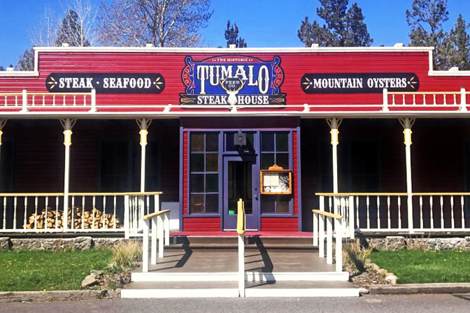
When VIVI DESIGN CO. (Bend, OR) took on a signage project for the Tumalo Feed Co. Steakhouse, a nearby historic restaurant, the idea was to maintain the spirit and authenticity of the establishment, while also freshening the look of a building built in 1965. In 1991, local signpainter Pat Thomas handpainted the signs for what was then called Tumalo Feed Co., but new ownership recently altered the name. (Bork said Thomas, now in his late 70s, still plays music at the restaurant once a week.) “As we worked on creating these signs for them, keeping the graphics traditional, Western and unique was the most important part in the design and build process,” said Janessa Bork, owner/designer at Vivi.
当维维设计公司(Bend,OR)为附近的一家历史悠久的餐厅黑料理(牛排馆)接手一个招牌项目时,他们的想法是保持这家餐厅的精神和真实性,同时也让1965年建造的这座建筑焕然一新。1991年,当地的招牌专家帕特·托马斯为当时的图马洛餐饮公司手绘了这些招牌,但最近新的所有权改变了这个名字。(博克说,现年70多岁的托马斯每周仍会在餐厅播放一次音乐。)维维的业主/设计师珍妮莎·博克说:“当我们为他们制作这些招牌时,保持传统、西方和独特的图形设计是建造过程中最重要的组成部分。”
Formed in early 2018 by Bork and Joshua Ramp, a pair of freelance illustrators, Vivi ideally suited the Tumalo job. Vivi is not only the lone sign and graphics company in Bend that still practices gilding and traditional handpainting of signs, but it also designs, fabricates and installs its work, too. “In Oregon, a lot of signpainters do work on location or don’t do work large enough that it needs to be installed,” Bork said. “That’s one of our niches.”
维维于2018年初由博克和约书亚·拉普(Joshua Ramp)两位自由插画师创立,非常适合图马洛的工作。维维不仅是本德唯一一家仍在进行标识镀金和传统手绘的标识和图形公司,而且还设计、制作和安装其作品。博克说:“在俄勒冈州,很多招牌专家都在现场工作,甚至安装标识,也这是我们企业长青的利基之一。”
Vivi designed four exterior signs for Tumalo, with the main logo sign checking in at 6 x 11 ft. and the double-sided road sign measuring 6.5 x 8.5 ft. – the biggest signs Vivi has built and installed to date. Medium-density overlay panel was used as the substrate– each sign required three sheets – and was painted with multiple 1Shot enamel colors, including Black, Metallic Gold, Brilliant Blue, Kool Crimson and Chrome Yellow. Vivi built and painted the signs in studio, with the main logo sign cut by a CNC router owned by SnoPlanks, a snowboard manufacturer whose boards Bork rides and represents as an ambassador in her spare time.
维维为Tumalo设计了四个外部标识,主标识牌的登记高度为6 x 11英尺,双面路标的尺寸为6.5 x 8.5英尺,这是Vivi迄今为止建造和安装的最大标识。中密度覆盖板被用作基底-每个标识需要三片-并涂上多种1热搪瓷颜色,包括黑色、金属金、亮蓝、库尔深红和铬黄。维维在工作室里制作并绘制了这些标识,主标识拥有的一台CNC雕刻机切割,Snopklks是一家滑雪板制造商,她在boards Bork业余时间担任顾问大使。
The signs were then disassembled for delivery and installation. On site, Vivi had to work around Tumalo’s vintage neon sign. “The signs blend into the historic building perfectly while making a bold statement with block lettering and detailed line work,” she said. “We sanded and repainted the pylon structure before installing the road signs, as well.” The new signs offer an updated appearance while prepping customers for an old-fashioned restaurant – and one of Tumalo’s famous steaks. So far, the new look is working; according to Bork, Tumalo has reported an uptick in customers since Vivi’s signs were installed.
在现场,维维不得不围着图马洛的老式霓虹灯招牌工作。她说:“这些标识完美地融入了这座历史建筑,同时用刻字和细线勾勒出了一个大胆的宣言,在安装路标之前,我们还对塔柱结构进行了打磨和重新喷漆。”新的路标提供了更新的外观,同时为顾客准备了一家老式餐厅——图马洛著名的牛排之一。到目前为止,新的外观正在发挥作用;据博克说,图马洛报告说,自从维维的标识安装以来,顾客数量节节攀升。
A (CANDY) EYE FOR SIGNAGE
招牌(糖果)眼

eyecandy SIGNS produced an open-faced marquee channel letter sign and a double-sided projecting sign for Fortune Doughnut.
糖果标牌为《财富》甜甜圈制作了一个开放式店铺招牌发光标牌和一个双面凸出标牌。
The stylization of their name says it all: eyecandy SIGNS . The distinctiveness with which this Canadian sign company based in Halifax, NS spells its moniker reflects its penchant for uncommon custom signage. The company’s original specialty was carved, sculptural and dimensional signage, but eyecandy has since branched out, engaging in “pretty much anything you can think of in the sign world,” according to Lead Sales Representative Jenna Lawrence. “In order to be competitive, you have to do everything,” she added. And after a recurring client came to eyecandy with a specific request and a brief timetable, one could add “efficient” to that competitive checklist.
他们名字的风格说明了这一切:糖果标识 。这家位于北卡罗来纳州哈利法克斯的加拿大标牌公司拼写其名字的独特性,反映了其对不寻常的定制标牌的偏好。据首席销售代表詹娜•劳伦斯(Jenna Lawrence)介绍道:“该公司最初的专业是雕刻、雕塑和立体标牌,但此后,eyecandy开始扩展业务,从事“在标牌领域几乎可以想到的任何事情”。她补充说:“为了有效的竞争力,你必须做一切事情,在你的客户面前,需要提供具体的解决方案和一个明确的时间表,就是说,你可以在竞争清单上加上“高效”二字。”
That client was Jeremy Smith, who owns a line of Freak Lunchbox candy stores in the area and was opening a new restaurant called Fortune Doughnut in Halifax. “He said, ‘I want letters with marquees in them, and I want them to be in these colors,’” Lawrence said, before adding Smith’s main condition to eyecandy. “Because he was under the gun for the opening, he said, ‘I’m only going to work with you if you can promise you’ll get this done [on time].’
那个客户是杰里米·史密斯,他在该地区开了一家名为“财富甜甜圈”的新餐厅,经营着一系列的甜点盒、糖果店。劳伦斯说:我想我们的糖果店里面包含这些糖果的元素和颜色。这个项目是否可以合作由他拍板,所以他说:“如果你能保证(按时)完成这件事,我们可以合作。”
Smith’s exterior sign request was actually twofold: the unique open-faced marquee channel letter sign, and a more straightforward double-sided projecting sign. For the latter, Smith hired a design firm to craft the branding for the three-eyed cat, which featured digitally printed graphics on raised ¼-in. black acrylic. The sign’s diameter measured 22 in., and included a 2 x 1-in. PVC disk to encapsulate the aluminum frame.
史密斯的外部标识要求实际上是双重的:独特的开放式的发光字母标识,和更直接的双面投影标识。对于后者,史密斯聘请了一家设计公司为这只三眼猫打造品牌,该公司在高达1/4英寸的猫身上采用数字印刷图形。黑色亚克力。标识的直径为22英寸,包括一个2 x 1英寸。用PVC字边条包住铝框。
For the channel letter sign, the letters were supported by a 2.5-in.-deep backer box constructed from 3 mm matte black Alupanel. The eyecandy team mounted 4-in.-deep letters directly to the backer with the inside faces painted in three colors: blue (Pantone 2198C), red (Pantone 1787C) and yellow (Pantone 116C). The 155 LED bulbs in the letters came from Showmen Supplies, a supplier to the carnival and amusement industry. Lawrence noted that the open-faced marquee lighting was a first-time pursuit for eyecandy. “I’ve done marquee lighting underneath awnings, but never front-face exposed marquee lighting,” she said.
对于发光字母标识,字母由一个2.5英寸深的衬垫盒支撑,衬垫盒由3毫米哑光黑色铝板构成。糖果团队将4英寸深的字母直接贴在背面,内表面涂成三种颜色:蓝色(Pantone 2198C)、红色(Pantone 1787C)和黄色(Pantone 116C)。发光标牌中155个LED灯泡来自嘉年华和娱乐用品供应商。劳伦斯指出:“我在店招下面做过照明的改变,但从来没有想过把她以店招的形式正面表现出来,开放式发光字母标牌是她最想要的糖果标识。”
“From design to fabrication to installation, the entire project lasted less than four weeks, fulfilling Smith’s request. The eye-catching colors and appearance of the signage also mirrors the eclectic appeal of Fortune’s doughnuts. (A word of caution: don’t gander at Fortune’s Instagram page on an empty stomach.) “There’s always a risk when you’re moving through something faster than you think you should be,” Lawrence said. “We decided to go for it, and it worked out beautifully.”
从设计到制造到安装,整个工程持续了不到四周,并且满足了史密斯的要求,招牌醒目的颜色和外观也反映了《财富》甜甜圈的吸引力。(提醒一句:你会在《财富》的Instagram页面上大吃一惊)劳伦斯说:“当以超出预期的速度前进时,总会有风险,但是,当我们决定去做这个糖果标识,结果真的非常好。”
LED SIGN, NEON LOOK
LED标识,霓虹灯外观

Humble Sign Co. came up with a unique multi-layered vinyl, front-lit channel letter design for Babin’s.
谦逊标识公司为Babin's设计了一款独特的多层发光字母标识。
In 2010, Bart Peterschick started Humble Sign Co. (Humble, TX) in the aftermath of the Great Recession with no background in the sign industry. “It was born out of desperation,” Peterschick said. “My situation was pretty bad.” Nine years later, Humble employs around 50. Its clients include Landry’s, which owns more 600 restaurants, hotels, casino and entertainment properties in the US. One of Landry’s restaurants is Babin’s Seafood House; Humble was tasked with finding an alternative to Babin’s former neon sign at its Katy, TX location.
2010年,在大萧条之后,巴特·彼得奇克创办了谦逊标识公司(德克萨斯州),当时没有任何标识行业背景。彼得奇克说:“那个时候刚开始真的很绝望,我们处境很糟糕。”九年后,谦逊标识雇佣了大约50名员工。其客户包括Landry's,该公司在美国拥有600多家餐厅、酒店、赌场和娱乐场所。兰德里的一家餐厅是巴宾的海鲜屋;Humble的任务是在德克萨斯州的凯蒂找到巴宾以前霓虹灯标识的替代品。
Humble formulated a few solutions for Babin’s, and the one that stuck was a multi-layered vinyl, front-lit channel letter design. The fabrication process began with two layers of vinyl being applied on each side of an acrylic substrate. After the vinyl was plotted, Humble used its CWT 1640 application table to lay the vinyl down. The shop ran its MultiCam APEX3R to CNC the channel letter faces, and Samsung LED modules provided the light source. “The stroke of the neon gets progressively wider with each layer of vinyl, so from distance, it gives it a glowing effect,” Peterschick said. “You would think you’re looking at an open-faced neon channel letter.”
谦逊标识为Babin's制定了一些解决方案,其中一个解决方案是多层发光标识,前置LED灯发光字母设计。制作过程开始时,在丙烯酸基底的每一侧涂上两层乙烯基。绘制乙烯基后,谦逊标识使用其CWT 1640来放置乙烯基。这家商店采用的是MultiCam APEX3R雕刻机对发光字母进行数控加工,三星LED模组光源。彼得奇克说:“霓虹灯的每一层乙烯基都会逐渐变宽,所以从远处看,它会产生发光的效果,开始你可能会误认为这是霓虹灯标识。”
Installation required eight hours and included removal of the existing neon sign, which was not salvageable, according to Humble Marketing Coordinator John Kim. With an assist from an Elliott L60 crane, installers carefully removed the old sign’s wires and letters, then mounted the new sign’s components along a curved wall. “The fabricators were able to build out each letter to account for the curvature,” Kim said.
这个标识安装过程需要八小时,包括拆除现有的霓虹灯标识,根据谦逊标识营销部专员约翰·金的介绍:“我们在Elliott L60起重机的协助下,安装人员小心地拆下旧标牌的电线和字母,然后沿弧形墙安装新标牌的组件,标识制造者能够把每一个字母都制造出来,并且说明它们是如何沿弧形墙来安装的。”
Humble previously used the multi-layered vinyl look with Saltgrass Steak House, another Landry’s restaurant. “[Landry’s] loved it,” Peterschick said. “So we’ve applied that concept to some of their other brands.” As for the fish pointing skyward out of the sign structure, those are a staple at every Babin’s. Humble hired a local mural artist to apply a fresh coat of paint to the fish. “I wish we could take credit for that,” Peterschick said. The pursuit of quality food and service must be a daily endeavor for these three restaurants, but they can rest easy knowing their entry signage has established a convivial atmosphere for their customers.
谦逊标识以前在另一家Landry餐厅盐草牛排馆使用多层乙烯基外观。彼得奇克说:“兰德里很喜欢,所以我们将这一概念应用到了其他一些品牌上。从标识结构中传达出飞向天空的鱼,这些是每个巴宾店里的主食。谦逊标识聘请了一位当地壁画艺术家为鱼涂上了一层新的油漆。彼得奇克说:“我真希望我们能为此得到赞扬。对这三家餐厅来说,追求优质的食物和服务必须是他们每天的努力,但他们可以放心,因为他们知道自己的入口标牌已经为他们的顾客营造了一种欢乐的氛围。

The double-sided road sign VIVI DESIGN CO.made for Tumalo.
为图马洛设计的双面路标VIVI设计公司。

The open-faced marquee channel letter sign that eyecandy SIGNS constructed for Fortune Doughnut.
为《财富》甜甜圈设计的糖果发光字母标识。