
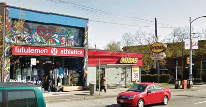
Founded in Vancouver in 1998, athletic apparel retailer Lululemon has established itself as one of the city’s most recognizable brands, with annual global sales exceeding $2.5 billion. The company’s first store opened near the corner of Arbutus and West 4th Streets and was situated beside a Midas Auto Service Centre.
1998年成立于温哥华的运动服装零售商露露柠檬公司(Lululemon)已成为该市最知名的品牌之一,该公司年全球销售额超过25亿美元。公司的第一家商店开在阿比特斯和西4街的拐角处,坐落在麦达斯(Midas)汽车服务中心旁边。
When the opportunity to purchase the Midas location arose, it was an easy decision for the team at Lululemon to buy the site and expand its original store to add a new women’s section, while the men’s section remained in the original location.
当购买麦达斯位置的机会出现时,露露柠檬的团队毫不犹豫的购买了该位置,并扩大其原有的商店,又添加一个新的女性专区,而男性专区则保留在原来的位置。
Keeping history alive
保持历史活力
When planning the build, Lululemon wanted to pay homage to the area surrounding the site, as well as to the long-standing Midas Auto Service Centre itself.
在规划建造时,露露柠檬公司就对标识公司表达了诉求,希望改造的时候表现对基地周围地区的敬意,以及对长期存在的麦达斯汽车服务中心本身的敬意。
The company contacted local specialty sign manufacturer TDH Experiential Fabricators to discuss the feasibility of repurposing the store’s existing pylon sign, which had been installed in 1971, into a Lululemon-branded sign, with the goal of keeping enough of the original sign’s shape and structure to ensure it would be recognizable to the local residents. Lululemon had already established a working relationship with TDH through previously completed specialty projects and knew the shop had experience in restorations, replicas, and aged signs.
公司联系当地著名的标识制造商TDH商,讨论再利用的可行性店里现有的桥塔标识,它原本安装于1971年,现在露露柠檬公司尽力保持足够的原始标识的形状和结构,以确保它能被当地居民接受。露露柠檬公司已经通过之前完成的专业项目与TDH建立了工作关系,并且知道这家商店在修复、复制和老化标识方面很有经验。
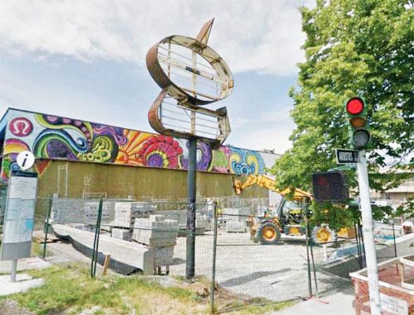
Upon inspection, it was discovered that the majority of the sign’s structure needed to be reconstructed due to severe rusting and outdated fabrication methods. Further, the installation needed to be re-engineered for stability and strength to satisfy current codes and standards. The sign also needed to be moved slightly to accommodate the store’s renovations, which required a new concrete foundation.
经检查,发现由于严重的生锈和过时的制造方法,大部分标识的结构需要重建。此外,安装需要重新设计以确保标识的稳定性和强度,以满足当前的规范和标准。标识也需要稍微移动,以适应商店的装修,这需要一个新的混凝土基础。
Logistics
后勤
The original Midas sign stood more than 6.7 m (22 ft) tall and measured 3 x 2 m (10 x 6.5 ft), with a depth of 0.6 m (2 ft). It was secured to an exposed 0.9- x 0.9-m (3- x 3-ft) concrete foundation, with the larger portion hidden under grade. The sign’s pole, which measured 254 mm (10 in.) in diameter, was bolted to an internal steel cage.
最初的迈达斯标识高度超过6.7米(22英尺),尺寸为3 x 2米(10 x 6.5英尺),深度为0.6米(2英尺)。它固定在一个暴露的0.9×0.9米(3×3英尺)的混凝土基础上,较大的部分隐藏在坡下。标识杆的直径为254毫米(10英寸),用螺栓固定在内部钢结构上。
Due to concern it would be damaged during construction, both the sign and its pole were removed and transported to TDH. After arriving at the shop, the sign was inspected by the fabrication team.
由于担心它会在施工期间受损,标识及其杆都被拆除并运输到TDH。到达商店后,制作团队对标识进行了检查。
Teamwork makes the dream work
团队合作让梦想成真
The design process took approximately three months to complete. Working closely with the design team at Lululemon, TDH drafted various concepts, each with its own story and connection to the history of the company, as well as to the neighbourhood. Lululemon was adamant about maintaining its current brand standards, which challenged TDH to find the balance between the old and the new. While the shape of the Midas sign was not particularly complementary to Lululemon’s brand, opening up the centre portion of its main shape created an architecturally interesting detail that pleased all parties.
设计过程大约需要三个月才能完成。 TDH与露露柠檬公司的设计团队密切合作,起草了各种概念,每个概念都有自己的故事,并融合了公司的历史以及社区故事。 露露柠檬公司坚持维持其目前的品牌标准,这对TDH要求在新旧之间找到平衡提出了挑战。虽然麦达斯标识的形状与露露柠檬公司的品牌并不是特别相辅相
成,但它的主要形状的中心部分的创造了一个建筑上有趣的细节,这特别的建筑风格,让所有人都感到欣喜。
TDH also had to contend with potential limitations in regards to sign permits within Vancouver. The city’s sign bylaws had undergone multiple revisions since the Midas sign’s original construction in the 1970s, which meant the installation likely did not meet current standards.
TDH还必须应对温哥华境内标识许可证的潜在限制。自20世纪70年代原始的麦达斯标识建造以来,该城市的标识章程经历了多次修改,这意味着该装置可能不符合现行标准。
Armed with the knowledge that these bylaws are fairly restrictive, TDH brought in its permit consultant, Priority Permits, to help navigate the complexities of the installation—especially since a variance application to the Vancouver council would be necessary to complete the project. With the assistance of Lululemon’s senior management team, TDH and Priority Permits came up with a strategy to satisfy as many of Vancouver’s bylaw requirements as possible, with the hope the remainder could be grandfathered.
有了这些相当严格的章程规定,TDH邀请了标识许可顾问,以帮助解决安装的复杂问题,特别是因为完成项目需要向温哥华理事会提出差异申请。在露露柠檬公司的高级管理团队的协助下,TDH和标识许可顾问提出了一项战略,以尽可能满足温哥华的法规要求,并希望其余部分能够获得豁免。
TDH suggested Lululemon write to the city, detailing the specific situation and outlining the company’s desire to remain true to the site’s original signage. The letter, signed by Lululemon’s vice-president, explained the benefit of preserving the Midas sign in regards to maintaining the neighbourhood’s unique character. The council, respecting Lululemon’s economic contributions to the city of Vancouver, as well as the company’s desire to reflect the past and the present through its restoration, approved the design.
TDH建议露露柠檬公司写信给这个政府,详细说明具体情况,并概述公司希望忠实于前公司的原始标识。这封由露露柠檬公司副总经理签名的信解释了保留麦达斯标识在保持邻里独特性方面的好处。该委员会尊重露露柠檬公司对温哥华市的经济贡献,以及该公司通过其修复反映过去和现在的愿望,批准了该设计。
Site construction begins
现场施工开始
With the sign permit application submitted to the city, the construction of the new building was well underway; however, some additional challenges regarding the sign’s installation began to surface.
随着标识许可申请提交给该市政府,新大楼的建设正在顺利进行。然而,关于标识安装的一些其他挑战也开始浮出水面。
For one, the sign’s existing concrete pad was sitting 0.3 m (12 in.) higher than that of the new building grade, which, as it was positioned near the entrance, posed a significant risk to pedestrians. Second, the existing sign location was incorrectly sited on the architects’ drawings and was much closer to the building’s façade than originally anticipated. These factors necessitated that additional reviews had to
be completed.
首先,标识的现有混凝土垫比新建筑等级高出0.3米(12英寸),因为它位于入口附近,对行人造成了很大的风险。其次,现有的标识位置在建筑师图纸上的位置不正确,比最初预期的更接近建筑的。由于这些因素,标识公司必须完成额外的审查。
The teams began by determining if the sign could be moved and affixed to a newly installed concrete foundation; however, this idea was quickly dismissed, as the sign would fall outside the property line.
小组首先确定标识是否可以移动并贴在新安装的混凝土基础上;然而,这个想法很快被驳回,因为标识将会落在房产线之外。
TDH then considered converting the original pylon design to a projecting sign. While this seemed to be the most logical option, it required the welding of steel support arms to the building’s steel structure, which was nearing completion. To efficiently accomplish this addition, the crew escalated the approval of the sign placement, which allowed enough time for the steel supports to be engineered and installed without affecting the building schedule.
TDH随后考虑将原始塔架设计转换为投影标识。虽然这似乎是最合乎逻辑的选择,但它需要将钢支撑臂焊接到建筑物的钢结构上,而钢结构已接近完工。为了有效地完成这一增加,机组人员提高了对标识位置的批准,这使得钢支架有足够的时间进行设计和安装,而不影响建筑进度。
Recreation through fabrication
制造娱乐
Once all approvals were in place, TDH’s fabricators began stripping and cutting out the sign’s rusted components. The installation’s old electrical wiring was also removed and its fluorescent tubes and ballasts were replaced with light-emitting diodes (LEDs).
一旦所有批准到位,TDH制造商就开始剥离和切割标识生锈的组件。该装置的旧电线也被移除,其荧光灯管和镇流器被发光二极管(LED)取代。
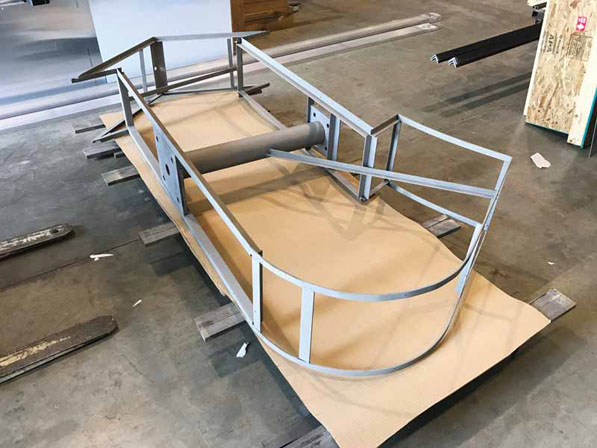
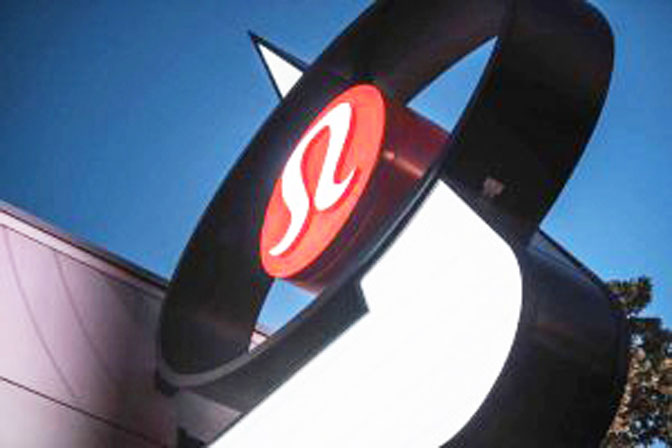
The majority of the structure was rebuilt with 6.4- x 51-mm (0.25- x 2-in.) welded angle and then sheeted to provide a clean finish. Extra attention was taken in securing the ‘yogo’—the brand’s signature logo shape—to the sign’s vertical pole, as this aspect needed to be as discreet, but also strong enough to support the top of the sign.
大部分结构采用6.4 x 51毫米(0.25 x 2英寸)焊接角重建,然后覆盖以提供一个干净的表面。特别注意将“优格”(该品牌标识形状),固定在标识的垂直杆上,因为这方面需要加以小心,确保标识杆足够强大以支撑顶部的标识。
Transport was also a consideration, as the installation’s size made this process very costly and difficult to achieve with the sign in one piece. Thus, the lower ‘arrow’ portion was built separately with an internal attachment plate to secure it to the upper ‘oval’ portion. This allowed the sign to be transported from the shop to the site on one truck bed. The two pieces were then hoisted by crane and assembled on-site before being lifted into place.
运输也是一个考虑因素,因为安装的尺寸使得这个过程非常昂贵并且难以通过标识整体实现。因此,下部“箭头”部分与内部附接板分开构建,以将其固定到上部“椭圆形”部分。这允许标识在一个卡车车厢上从车间运输到现场。然后将这两件用起重机吊起并在现场组装,然后提升到位。
The engineered attachment design allowed the sign’s steel tube arms to slip inside the steel structural tubes that had been welded to the building’s steel structure. The tolerance, however, was only 6.4 mm (0.25 in.), which meant the welding to the building steel needed to be accurate, as did the tube placement on the two sections of the sign.
工程附件设计允许标识的钢管臂在已焊接到建筑物钢结构的钢管内滑动。然而,公差仅为6.4毫米(0.25英寸),这意味着建筑钢的焊接要必须准确,标识的两个部分上的管道放置也是如此。
As the sign was comprised of two separate pieces, it was necessary to determine precisely how these sections would fit together prior to installation. As such, TDH completed three site inspections to ensure the tube arms of the sign they were fabricating aligned with those fixed on the building.
由于标识由两个独立的部件组成,因此有必要在安装之前准确确定这些部分如何组合在一起。因此,TDH完成了三次现场检查,以确保他们制造的标识的管臂与固定在建筑物上的标识对齐。
A seamless installation
无缝安装
To complete the installation, TDH partnered with fellow Vancouver-based sign shop Tops Lighting, which provided the large equipment required for the job, as well as qualified personnel with many years of experience.
为了完成安装,TDH与位于温哥华的标识店Tops Lighting合作,该公司提供了工作所需的大型设备,以及具有多年经验的合格人员。
As the site was located at a very busy intersection, TDH hired a local traffic control company to block the sidewalks and street, which allowed the crane and bucket trucks to get into proper position. Nonetheless, the on-site assembly and installation was challenging; the glass awning situated below the sign only allowed for a few inches of clearance when the sign was hoisted into place—any deviation or even a gust of wind could have caused it to swing and hit the glass.
由于该站点位于一个非常繁忙的十字路口,TDH聘请了一家当地的交通控制公司来阻挡人行道和街道,这使得起重机和斗式卡车能够顺利进入安装的地点。尽管如此,现场组装和安装仍具有挑战性。当标识悬挂到位时,位于标识下方的玻璃遮阳篷只有几英寸的间隙,任何偏差甚至一阵风都可能导致它撞击玻璃。
Fortunately, through a tedious hoist and much-needed guidance by two crews in bucket trucks, the sign was successfully slipped into the tubes with no damage to the glass. The bolts were put in place, the power was hooked up, and final touch-ups were added.
幸运的是,通过一个繁琐的提升机和两个工作人员在斗式卡车中专业的指导,标识成功地滑入管中而没有损坏玻璃。将螺栓放置到位,连接电源,并添加最后的修饰。
After 14 months of designs, securing permits, and fabrication, Lululemon’s repurposed sign, reflective of the old and the new, was successfully installed.经过14个月的设计,制造和安装,露露柠檬公司的改装标识,融合了旧的和新的,最后大功告成。
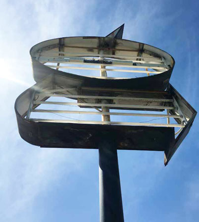
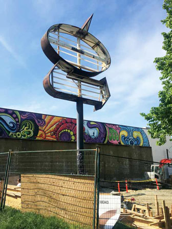
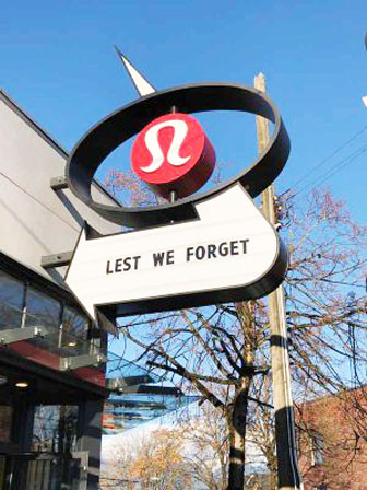
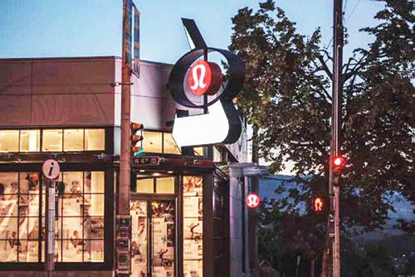
Taking a closer look at Lululemon’s repurposed sign TDH Experiential Fabricators aimed to maintain the shape and structure of the original Midas sign.
Upon inspection, it was discovered the majority of the sign’s structure needed to be reconstructed due to severe rusting and outdated fabrication methods.
检查后,发现大多数的标识由于严重的生锈和过时的制造方法结构需要重建。
As the sign was comprised of two separate pieces, it was necessary to determine precisely how these sections would fit together prior to installation.
由于该标识由两个单独的部分组成,因此有必要在安装前准确确定这些部分将如何组合在一起。
TDH opted to convert the original pylon design to a projecting sign.
TDH选择将原来的塔设计转换成一个突出的标识。

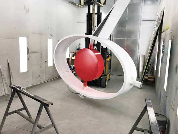
Extra attention was taken in securing the ‘yogo’—Lululemon’s signature logo shape—to the sign’s vertical pole.
在确保“yogo”——露露柠檬的标志性标识形状——被固定在标识的立柱上时,人们要格外小心。
After purchasing a lot that had been home to a Midas Auto Service Centre, Lululemon decided to repurpose the site’s existing pylon sign.
在购买了麦达斯汽车服务中心的旧址后,露露柠檬公司决定重新利用该基地现有的塔架标识。
Lululemon wanted to keep enough of the original sign’s shape and structure to ensure it would be recognizable to local residents.
露露柠檬公司希望保留足够的原始标识的形状和结构,以确保当地居民能够识别它。
The original Midas sign was built and installed in 1971.
最初的麦达斯标识建于1971年。
Due to complications surrounding the existing concrete pad, TDH opted to convert the original pylon design to a projecting sign.
由于周围现有的混凝土垫层的复杂性,TDH选择将原来的塔设计转换成一个突出的标识。
 The sign’s old electrical wiring was removed and its fluorescent tubes were replaced with light-emitting diodes (LEDs).
该标识的旧电线被拆除,荧光灯被换成了发光二极管(led)。

When planning the build,Lululemon wanted to pay homage to the area surrounding the site,as well as to the long-standing Midas Auto Service Centre itself.
规划建设时,露露柠檬想致敬站点周边地区,以及长期麦达斯汽车服务中心本身。