In 1937, Indiana officials adopted “The Crossroads of America” as the state's motto. It's an appropriate nickname – depending on which direction you move, a day's drive (approximately 500 miles) or short flight from Indianapolis could send you to Buffalo, Atlanta, Kansas City or Minneapolis. Such convenient proximity to so many places has undoubtedly helped such Indiana-based corporate stalwarts as Anthem, Eli Lilly and Simon Property Group grow. Moreover, a trip to the Hoosier State could yield varied cultural experiences; Shipshewana’s Amish farms and shops, the sand dunes along the Lake Michigan shoreline and the Indianapolis Motor Speedway attract diverse demographics.
1937年,印第安纳州官方正式通过了将“美国中心”作为该州代言词的提议。这个昵称非常恰当——因为无论你要去哪个地方,从印第安纳波利斯只需一天的车程(大概500英里)或短程航班,就可以到达布法罗、亚特兰大、堪萨斯城或明尼阿波利斯市。与这么多城市比邻无疑促进了印第安纳州公司的发展,譬如 Anthem、Eli Lilly和Simon Property Group。同时,如果你到山地人之州旅行,你会讶异于其多样的文化底蕴:西普谢瓦纳的亚美希农场和商铺、沿着密西根湖岸线的沙丘,还有吸引不同人群的印第安纳波利斯赛车场。
Alas, it's not my bailiwick to assist the Indiana Chamber of Commerce, nor its Board of Tourism. However, the Hoosier State's 200th anniversary of statehood deserves commemoration via its signs. So, to honor America's 19th state and its milestone, here's a quartet of Indiana signshops. They're as diverse as the state's points of interest.
促进印第安纳贸易和旅游业的发展都不在我的管辖范围之内。然而,山地人之州200周年庆应该有属于它的纪念标识。因此,为了纪念美国19个州和其划时代的事件,一共有四家标识商铺参与其中。他们结合该州的特点做出了多种多样的标识。
Creative Sign Resources
创意型标识资源公司
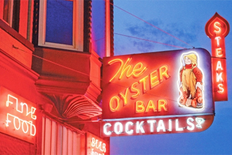
(The Oyster Bar)
(牡蛎酒吧)


In coastal areas, oyster bars are nearly as widespread as surfboard shops and sand fleas. However, in landlocked Fort Wayne, IN, diners have enjoyed oysters at this restaurant since 1888. Creative Sign Resources, also of Fort Wayne, built this handsome neon-lit throwback, which features typography – and the requisite “Cocktails” and “Steaks” panels beneath and alongside the main sign – reminiscent of a 1950's-era Main Street. The lobster-wielding fisherman is reminiscent of a villain from a Nancy Drew novel.
在沿海地区,牡蛎酒吧就像冲浪板商铺和沙蚤一样普遍。然而,在陆地范围的韦恩堡就不那么常见,但是用餐者在这家餐厅从1888年开始就享用到了牡蛎。创意型标识资源公司制作出美观复古的霓虹灯照明标识,其主要特色是将主要的“Cocktails”和“Steaks”嵌板分别安装在整个标识的底边和侧边,它们是用来纪念20世纪50年代的缅因街。手持龙虾的渔夫让人联想到小说《神探南茜》中的一个反派人物。
(Dari Sweet)
(甜蜜达里)


Another retro-cool sign from Creative Sign Resources. This Kimmel, IN diner – where the waitstaff will serve food to you in your car – features a Googie-style swooping arrow and starburst, as well as a moniker reminiscent of the era (during the 1950's, “Dari,” “Rite” and “Lite” were commonplace). However, in acknowledgement to modern technology, LED bulbs and modules replace incandescent lamps on the arrow and neon inside the cabinet.
甜蜜达里是创意型标识资源公司制作的另一个复古酷炫标识,这是一家在车上经营的餐厅。该标识是由带亮光的以未来主义风格为特征的俯冲箭头和怀旧年代(20世纪50年代“达里”,“利特”等老生常谈的)的名字组成。同时此标识也将现代技术融入其中,箭头部分采用LED灯泡和模组来代替白炽灯照明,灯箱内部采用霓虹灯照明。
Bloomington Design
布卢明顿设计公司
(Blue Moon)
(蓝月亮)

Gary Anderson, formerly the proprietor of Bloomington Design (Bloomington, IN), retired three years ago. However, he's left a strong legacy of handcrafted signs throughout Indiana that's endured since retirement. This 7-ft.-tall sign for a Bloomington consignment shop is mounted in ground with concrete-set, treated 4 x 4 posts and stainless steel screws, which are used throughout the the sign and base. The signboard was cut from medium-density-overlay plywood (MDO) using jig and band saws, and the lettering is comprised of PVC. The larger hanging stars were fashioned from gilded cast iron and secured with steel straps, and smaller stars were made from handcarved high-density urethane (HDU) and gilded. Everything was cut-out by hand with jig and band saws. Small lettering on border is hand lettered with acrylic latex paint, all other finishes are also acrylic. Large cutout text has been attached to background with silicone and stainless-steel nails.
布卢明顿设计公司前任经营者盖理·安德森三年前就退休了。然而,他为印第安纳州留下了宝贵的财富——纯手工制作标识技术,并延续至今。这块布卢明顿设计公司托运来的7英尺高的标识用混凝土将其安置在地上,用四根标杆和不锈钢螺钉固定整个标识和底部。用夹具和环形锯将标识板切割成中等密度的胶合板,字母是用PVC板做成的。较大的悬挂式星星是用镀金的生铁做成并用钢板将其固定,较小的星星是用手雕高密度尿烷做成并镀金。所有的零件都是用夹具和环形锯手工切割的。边缘上的小字母是用亚克力乳胶漆手写的印刷体,其他的成品也都是亚克力板材。大的板子是用硅树脂和不锈钢钉子将其固定成背景。
(For the Birds)
(爱护鸟类)

This Nashville, IN shop caters to bird enthusiasts. Anderson built the 5-ft.-wide sign from MDO and handpainted it with acrylic-latex paints. He conformed the custom steel bracket to the shape of the sign and bolted it to the post with lag screws, links and eyebolt screws for the sign.
这家位于纳什维尔的商铺主要是为鸟类爱好者服务的。安德森用中等密度胶合板做成5英尺宽的板子,然后用亚克力乳胶漆进行手绘图案。他将钢支架做成与标识匹配的形状,然后用拉力螺钉、链环和螺栓将其固定在柱子上。
Green Signs
格林标识公司
(Rush Memorial Hospital)
(拉什纪念医院)

As the healthcare industry becomes more competitive, signage for medical facilities has received greater emphasis. Green Signs (Greensburg, IN) fabricated this building's signage, which features an 82-in.-tall logo and 23-in.-tall letters, using 0.125-in.-thick aluminum that's fabricated on a Computerized Cutters' Accu-Bend machine. Green Signs illuminated the signs with JS LED white modules that are spaced 4 in. apart. The sign and logo were fastened using aluminum allthread, stainless-steel hardware and caulk. Shawn Green, the company's president, said, “It was interesting to find that concrete in a building constructed more than 100 years ago is stronger than modern concrete. Drilling through it took longer than expected.”
随着医疗保健行业变得更具竞争性,医疗标识也得到了重视。格林标识公司(位于印第安纳州的格林斯堡)制作了这个医院标识,它由82英尺高的商标和23英尺高的字母组成,商标和字母都是用数控切割设备将0.125英尺厚的铝型材切割成的。该公司采用白色JS LED模组制作发光标识。该公司负责人肖恩·格林称:“我们发现100多年前建造的建筑物使用的混凝土比现代混凝土更加坚固,将其钻孔的过程所花费的时间远比我们预想的长。”
(Union 50)
(联盟50)

Located in Indianapolis' trendy Massachusetts Avenue neighborhood, Union 50 is a chic restaurant that boasts distinctive signage that differentiates it from competitors. Green Signs fabricated this sign from 0.125-in.-thick aluminum that's cut to shape on an AXYZ CNC router and MIG-welded. Lord Adhesives bonding agents were used to secure layers together. JS LED modules illuminate the sign. The shop also constructed stainless-steel channel letters for the restaurant’s interior.
坐落于印第安纳波利斯时尚之都——马萨诸塞大道街区的联盟50,是一家很别致的餐厅,它以区别于其他竞争者的特色标识而闻名。格林标识公司用AXYZ CNC数控设备将0.125英寸厚的铝型材切割成形,然后用MIG进行焊接,再用洛德粘合剂将层板固定在一起,用JS LED模组照亮此标识。格林公司还为该餐厅制作了不锈钢槽型发光字。

Indianapolis Signworks
印第安纳波利斯标识制作公司
(The Cottages at Lindbergh)
(林德伯格小屋)

Signs play a key role in creating curb appeal for multi-family dwellings. Indianapolis Signworks fabricated the sign structure from 0.125-in.-thick aluminum, and printed the graphic on clear vinyl that's decorated on an HP latex-ink printer. According to Andy Chapman, the shop's president, the print's translucent quality provides a “brilliant” bronze effect. Fabricators joined components with stainless-steel hardware.
标识对多户住宅建筑的外观吸引力有很大的影响。印第安纳波利斯标识制作公司用0.125英寸厚的铝型材做成标识架构,用惠普乳胶油墨喷印机将乙烯基喷绘成装饰图文。按照该标识公司负责人安迪·查普曼的想法,喷印成半透明的材质会展现出青铜色的效果。制作者用不锈钢五金器件将零件固定在一起。

(Preserve at Grande Oaks)
(格兰德奥克斯保护区)
Indianapolis Signworks built this distinctive monument sign for a West Lafayette, IN (home of Purdue Univ.) apartment complex. The 5 x 8-ft., geometric creation features layers of various thicknesses of acrylic and PVC, and 1/4-in.-thick perforated metal. All components were cut to shape on the shop’s Gerber Sabre 408 CNC router. The layers of text and graphics were installed on treated, stained deckboard.
印第安纳波利斯标识制作公司为西拉斐特(普渡大学所在地)公寓大楼制作了独特的纪念标识。该标识有5英尺高、8英尺长,用各种厚度的亚克力和PVC板做成几何形状的元件和1/4英寸厚的穿孔金属板。这些元件都是用格柏Sabre 408 CNC数控设备切割成形的。文字和图案被安装在处理染色过的面板上。